Get a Nando's
Merging distinct delivery and collection ordering systems, boosting conversions by over 40%
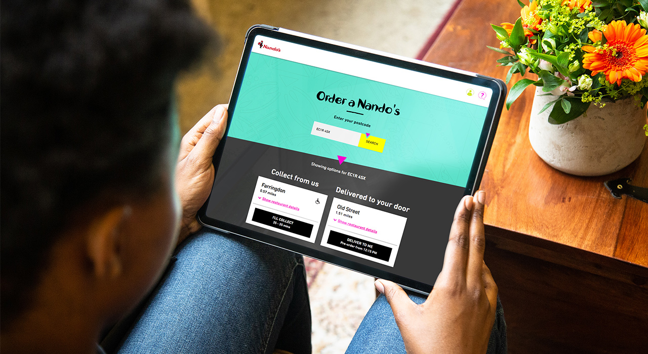
In late 2017 Nando’s began rolling out a home delivery service to their restaurants.
Collection had been around for a while and customers were excited for home delivery from the UK’s top casual dining restaurant, but the two ordering options had completely distinct experiences.
In 2018 we came on board to merge collection into the newer delivery system, and improve both journeys in the process.
Discovery
Working in regular feature sprints, we spent at least one day a week at each other’s office so we were all around to collaborate, eat discounted chicken, and make use of the adult slide in the Nando’s lobby.
I gathered info to map the existing processes including email and SMS messaging.
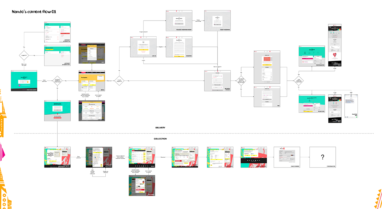
Flow diagram of the existing collection and delivery services
Through this, UI audits, user stories, and collaboration with the tech team and suppliers, we understood the systems and had the basis for a sprint plan and a preliminary flow for the new ordering journey. We returned to this diagram throughout the project, updating the model to include backend touchpoints and serve as a master reference for the flow.
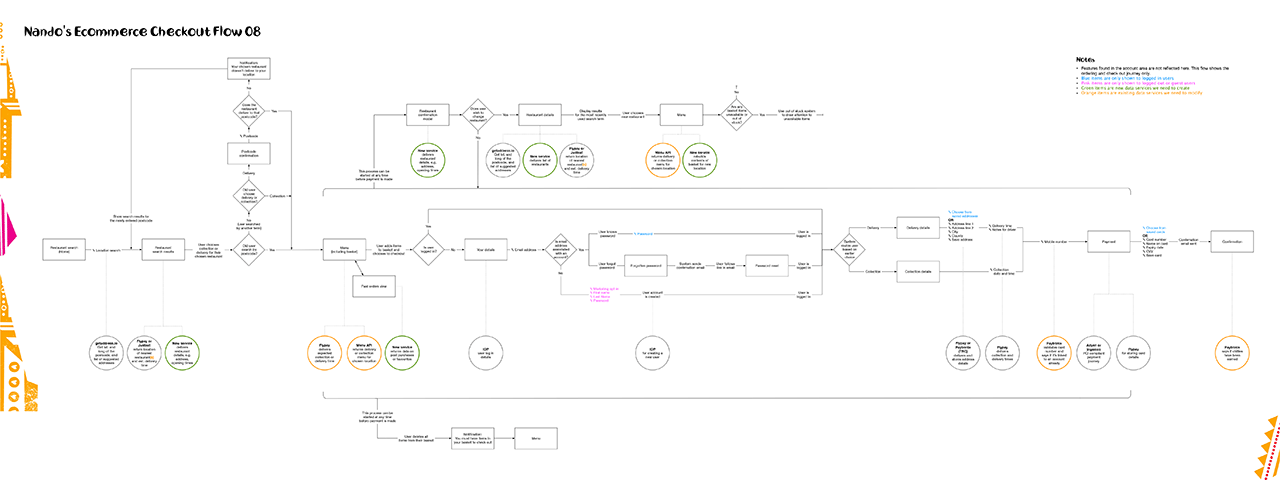
Flow diagram of the proposed experience, combining delivery and collection, including backend touchpoints for developer reference
In each sprint we tackled a few user stories and planned our process to suit.
Design
Streamlining registration and log in during check out
Our main objective was to better integrate registration into the check out flow. In the pre-existing journey, unregistered users trying to check out were routed to the registration journey, then back to check out. The step tracker didn’t reflect this, showing the user stuck on the first step of check out even as they navigated multiple pages to register. Wording made it difficult to find the registration option, and the form itself repeated fields from other pages.
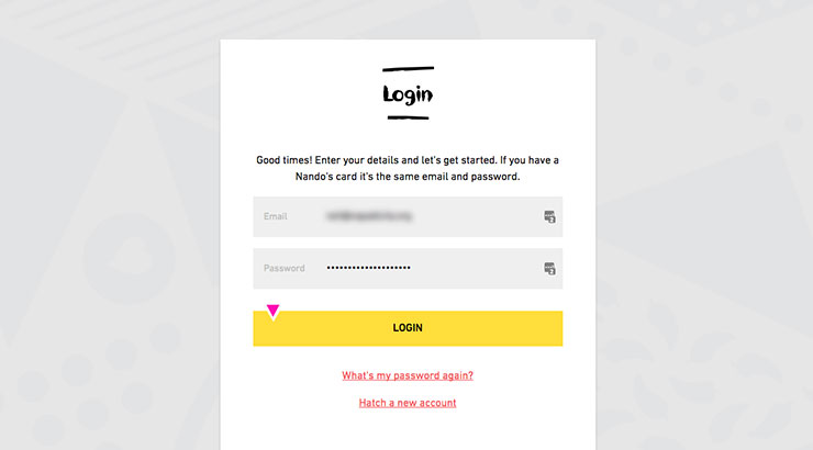
Signing in on the old site – the ‘Hatch a new account’ link leads to registration
Through conversations with Nando’s stakeholders, back end suppliers, and our tech team, I proposed a streamlined flow to address these points while respecting technical constraints
I conducted competitor research examining similar services like Pizza Hut, auditing the multiple Nando’s log in systems, and seeking interaction patterns in other places.
Doing the hard work, so customers don’t need to
At the time, a Nando’s customer could own accounts on multiple systems: delivery, collection, and loyalty. Though one system would be eliminated by the merger, customers may not know what accounts they owned or which to use.
I recommended a two-step log in process used by Apple and Eventbrite, to address this. By submitting email address first, the system can present a password field to existing users and a registration form to new users. Users don’t need to do detective work to discover if they already have an account, and new users retain their location in the checkout flow.
We took inspiration from Metro Bank’s principle of avoiding shutters and glass barriers in their branches, designing for customers, not criminals Collaborating with the tech team, we pre-empted concerns that explicitly acknowledging the existence of accounts was a security threat by demonstrating that any determined attacker can discover the presence of an account. Understanding this, the Nando’s stakeholders agreed it was unnecessary to obfuscate things for genuine customers.
From concept to reality
I integrated the two-step log in process into a responsive Axure RP prototype of the whole ordering journey, including form logic to recognise email addresses so we could test flows for recognised and unrecognised users. I conducted four rounds of user testing with the prototype, including two guerrilla sessions in Nando’s restaurants.
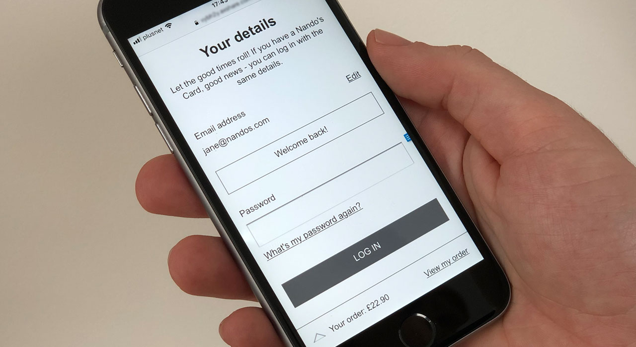
Axure RP prototype of the check out journey running on mobile – the customer’s email address has been recognised, so they see a login form instead of a registration form
Working closely with the visual designer, we struck a balance between the bold, fun Nando’s branding and the clarity required for a smooth customer experience.
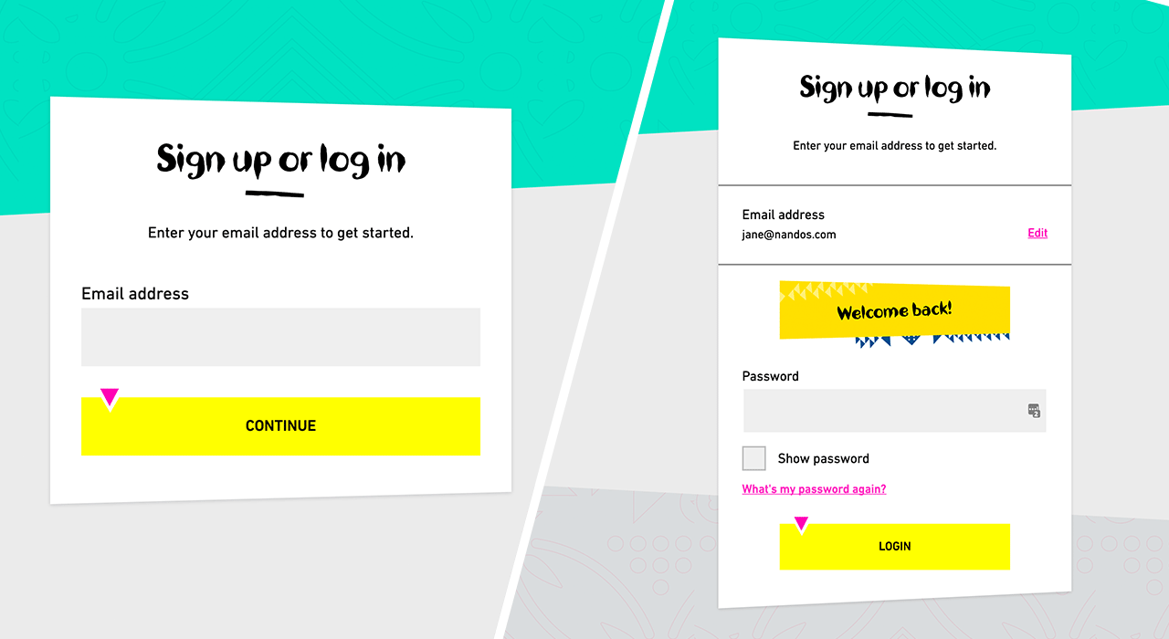
Left: the combined registration and sign in form as it appears on arrival. Right: the form has recognised the email address of a registered user, so shows the password field.
As we prepared for launch, I worked with the analytics team to ensure their tracking specification included events and measures we could use later to assess performance and target areas for improvement.
Throughout, I used sketching and note taking to record and make sense of information, explore ideas, and share concepts.
Outcomes
We tweaked our process to refine, introduce, and cull many other features. Here are a few more examples.
Search
The old collection site had two search fields: search by your location, or search a list of restaurant names. Since restaurants are simply named after their location, the second field was redundant.
The first field was actually a lot smarter than postcode search. You can search by almost anything: postcode, house name, the nearest pub… so we removed the second field. It’s Google search, but for chicken.
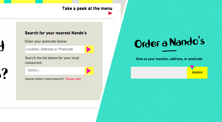
Left: the two search fields on the old site. Right: the new site where we removed an unnecessary field and made the flexibility of the other apparent.
Decisions, decisions
At every step we took care to emphasise the key decision required of the user. Search results show the closest collection and delivery options side-by-side if they’re not from the same restaurant. We lead with collection as it saves delivery costs for both parties, and the customer gets their food quicker.
If there are other collection restaurants nearby we offer them below. These are always stacked in a vertical list and have less contrast to keep focus on the suggested restaurants.
Restaurant details
Search results on the collection site showed a lot of information about the selected restaurant. This complicated the view and eclipsed the alternative restaurant options below.
We condensed restaurant details into an expandable, reusable module. Only the most critical details are always visible, relevant information is available in the expanded area, and we link to the restaurant’s full details page for irrelevant information.
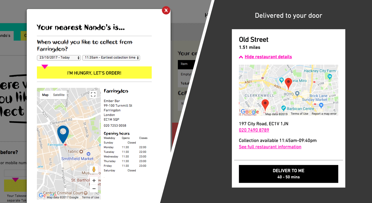
Left: restaurant search results on the old collection site. Right: the new restaurant details module shows only the most important details – name, distance, and delivery time – and can expand to show extra information.
Speed run
At every step we looked for ways to speed up the process for returning users. When you return, you can jump straight to the menu with your last restaurant and fulfilment method selected.
From the menu you can quickly add one of your recent orders to the basket, and use the tools there to tweak it before check out. This replaced an under-utilised favourites system.
